Soban Korean Eatery
A menu system redesign for a fast-casual Korean restaurant. Keeping every piece of information, halving the visual noise.
Soban is a fast-casual Korean restaurant that opened in Hales Corners and recently expanded to a second location in downtown Milwaukee. The brand is run by Solki (owner) and Hyelim (CFO). Both are deeply involved in shaping how the restaurant looks, reads, and feels to first-time guests.
In 2025, Soban commissioned a redesign of their menu system across both locations. The goal was not a full rebrand, but a sharpening. Keeping every piece of information the customer already relied on, while replacing the visual language with something quieter, cleaner, and easier to scan.
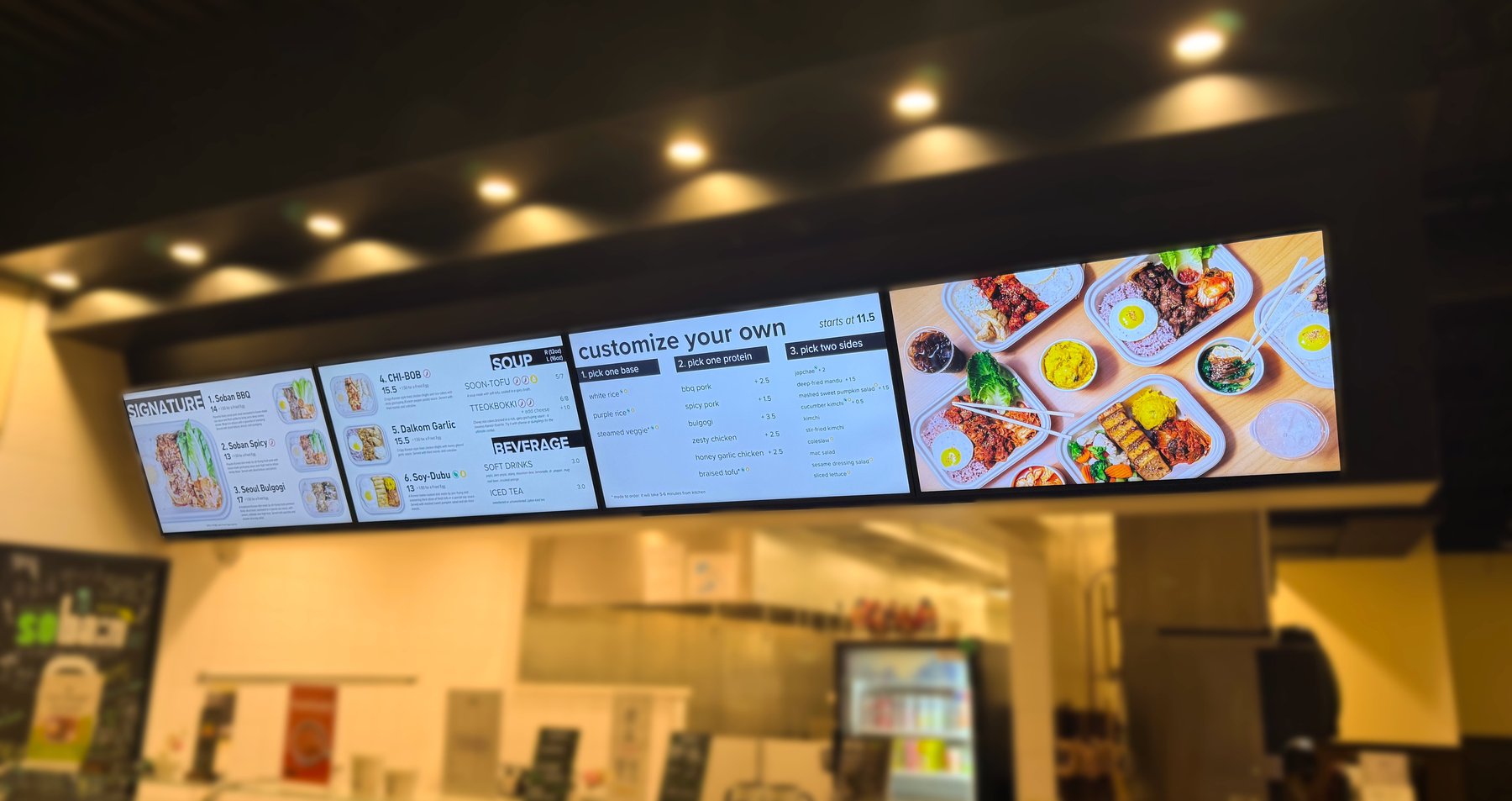
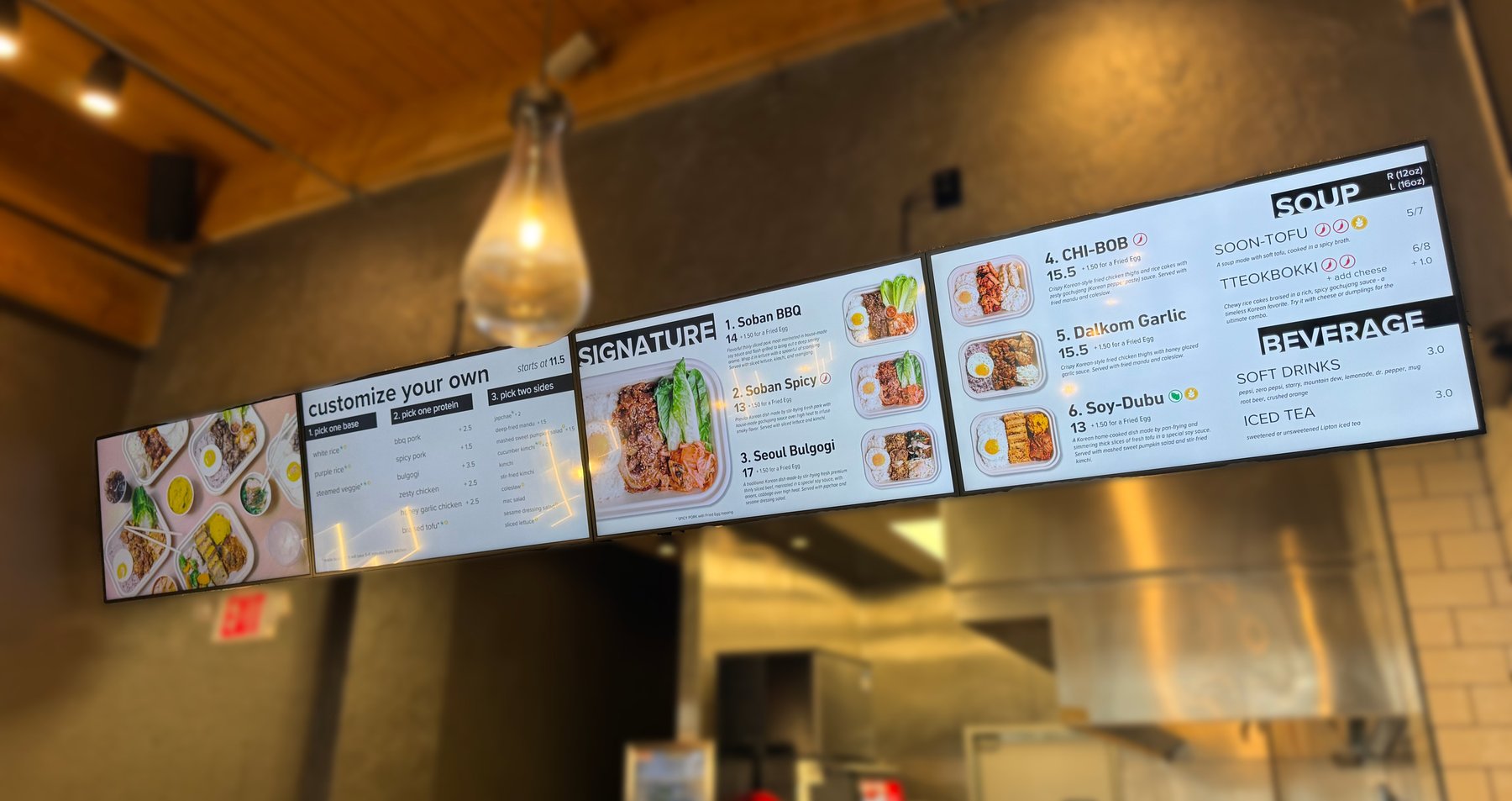
The existing menu boards leaned playful: bright greens, bold strokes, expressive typography. It worked when Soban was a single location, but as the brand grew it started to feel out of step with where the restaurant was going.
Solki and Hyelim asked for something modern, simple, and highly legible, using as few colors as possible, with generous whitespace, but without losing a single piece of information from the existing boards.
That last constraint was the real challenge. The old boards were dense: six signature dishes with photos and descriptions, a build-your-own section with three steps, soup, beverages, sides, prices, dietary icons, modifiers. All of it had to fit in roughly the same physical space, but feel half as crowded.
How it was made
A clear brief, before any design
Solki and Hyelim came in with a sharp direction and a set of reference images they liked: minimalist menu systems with strong type hierarchy and lots of breathing room. That made the early decisions easier than they usually are: black and white as the base, photography doing the color work, numbered structure replacing the old icon-heavy navigation.
Inventory before layout
Before opening InDesign, every piece of text, every price, every icon from the old menu was pulled into a single document. Nothing could be cut without sign-off, so the first job was just understanding exactly what the customer needed to see.

Hierarchy doing the work
The hardest part was fitting the old menu's information into a layout that felt twice as spacious. This came down to typographic hierarchy: pulling section headers into solid black blocks (SIGNATURE, SOUP, BEVERAGE), letting dish names breathe at a larger size, and demoting descriptions to a quiet secondary weight. Every element earned its size by its importance to a customer in line.
Two locations, one system
The Hales Corners and downtown Milwaukee boards share the same system but adapt to slightly different physical contexts: different ceiling heights, different lighting, different total panel widths. The grid stretches and contracts cleanly across both.
The redesigned menu boards are now in use at both Soban locations. Solki reported that the space felt visibly cleaner after install, and that staff preferred working under the new boards.
For me, this project sat exactly where I want my work to live, using minimalism not as a style, but as a tool to let the most important information speak first. It became a clear reference for what I'm trying to do across the rest of my practice.