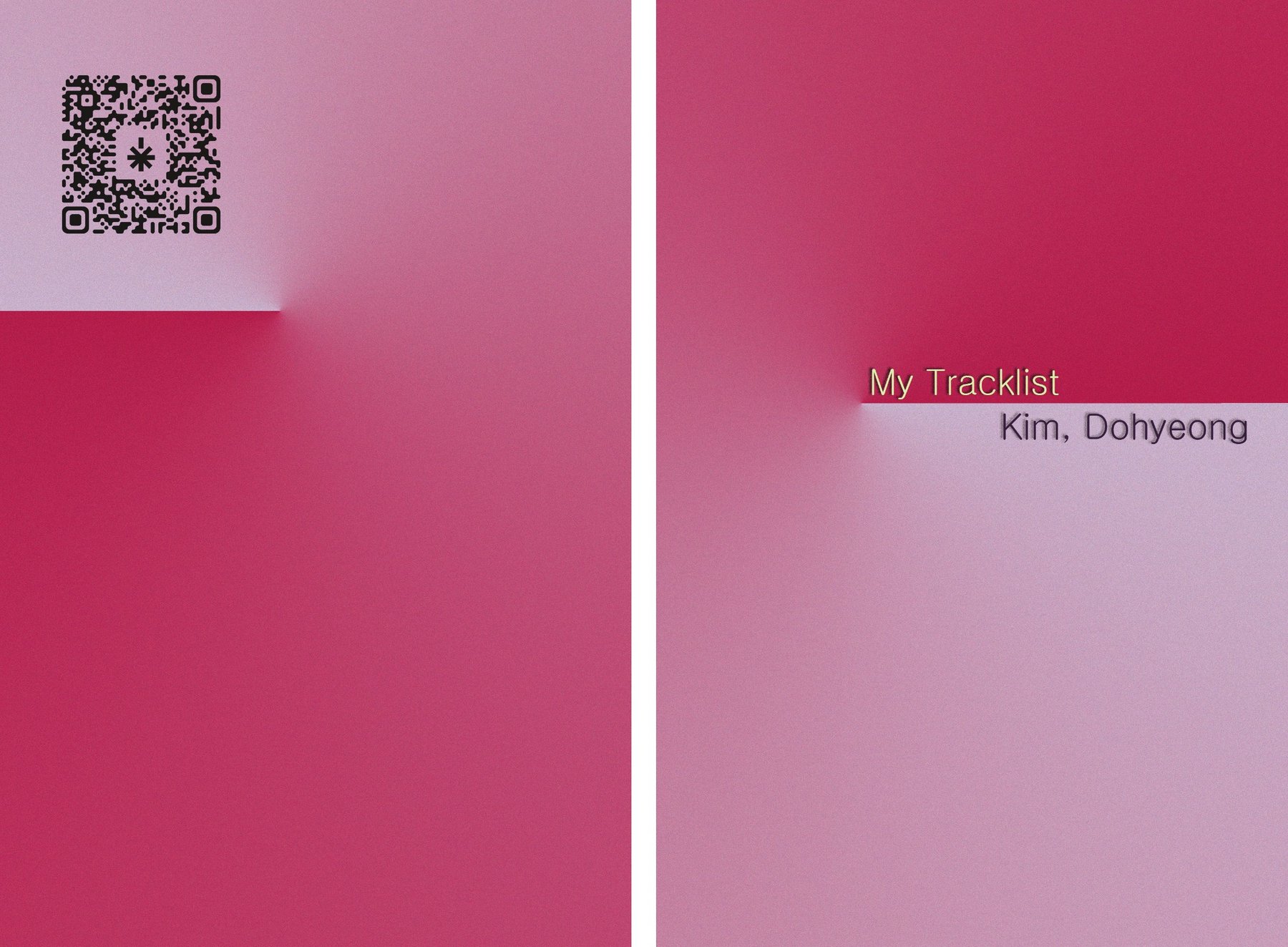
My Tracklist
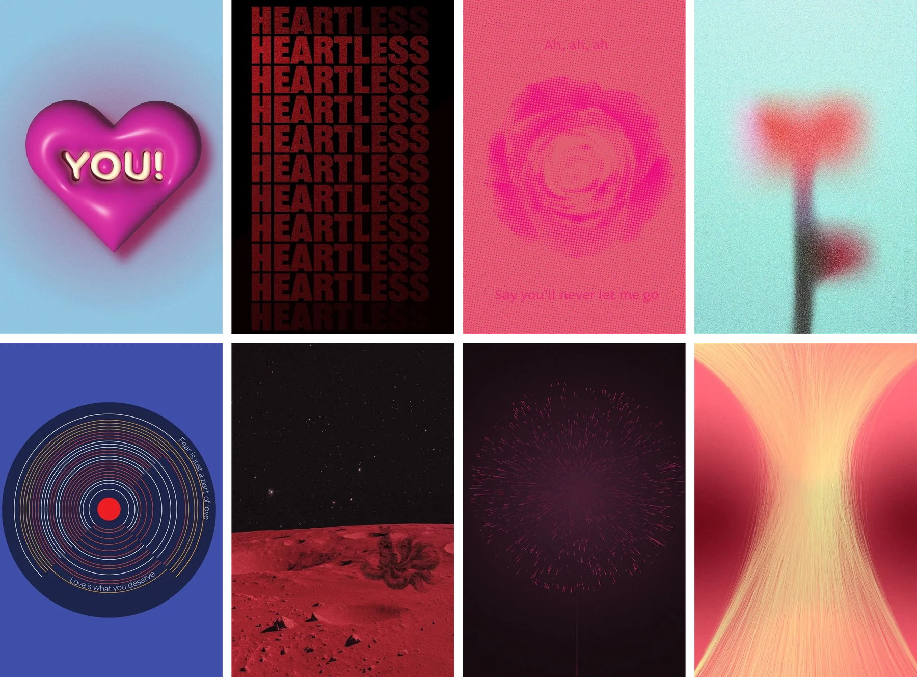
84-page capstone book. 35 songs, 35 posters, turning audio input into visual output. Exhibited alongside Out of Plane.
My Tracklist is the capstone book project for DVC III at UWM, the final exhibition course of the Design & Visual Communication program. The brief was open: write a book about yourself.
Mine became a book of 35 posters, one for every song that defines me. Each spread pairs a short note about why the song matters with a poster that translates the song into a visual. The book is 84 pages, perfect bound, 9 × 6 inches, printed in 4 copies through Blurb. It was exhibited alongside Out of Plane (the DFD capstone) as the second half of my graduating show.
The brief was write a book about yourself. The hardest part was not the design. It was deciding what 'myself' actually means inside a book that has to function in a graduating exhibition.
Two constraints set the direction.
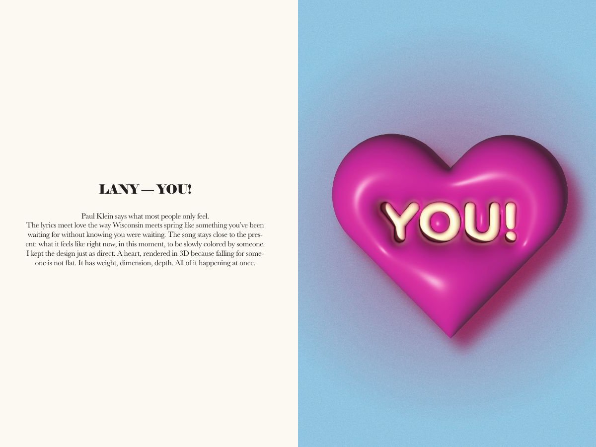
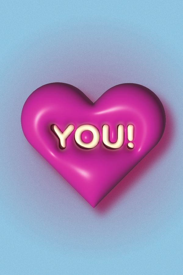
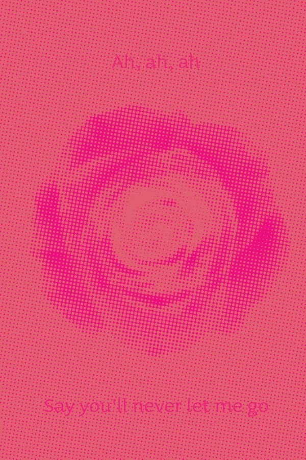
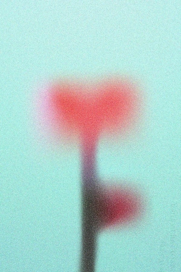
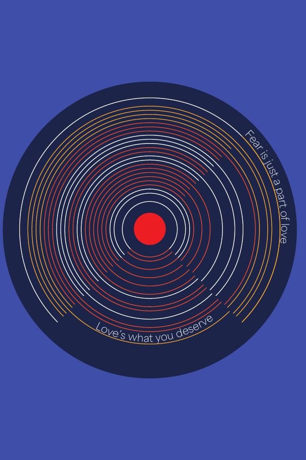
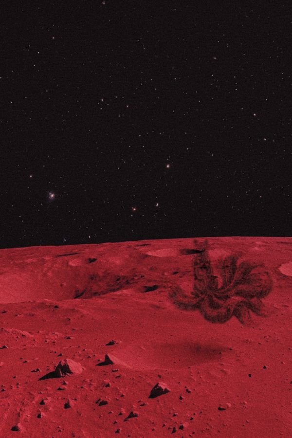
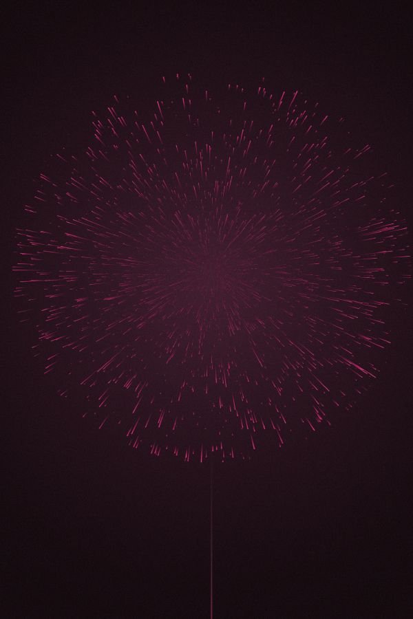
First: how do you represent a person honestly? I'm a designer, not a writer. The thing I'm most fluent in is turning audio input into visual output. That's the work I want to be doing anyway. So a person, for me, is the music they listen to. Build the book around the songs that have shaped me, and let each one become a poster.
Second: how do you make a book work in a 40-student exhibition? Realistically, no visitor would sit down and read it cover to cover. The book had to function as something you could open at any page and immediately understand. That ruled out narrative arc, sequential structure, or anything that required Page 1.
How it was made
One song, one poster, one note
The structure across the whole book is the same: a short personal note on the left page (why this song, what it means, what design decision came from that), a full-page poster on the right. No table of contents in the conventional sense, no progression. Every spread is a self-contained unit.
Every poster, a different design language
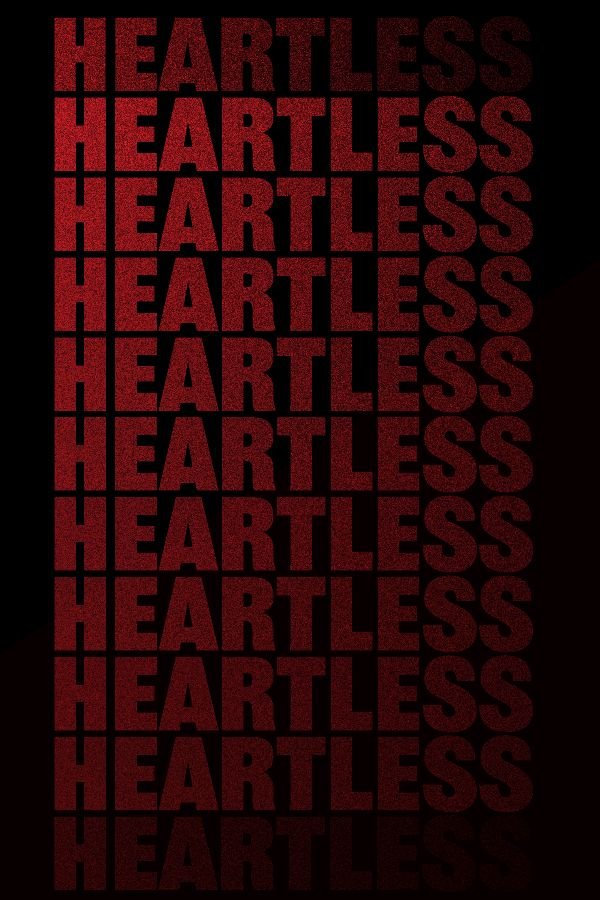
The thesis was turning audio input into visual output, which meant every poster had to be designed to its own song, not to a unified system. A song that's heavy gets heavy weight typography. A song that's airy gets space. A song built on repetition gets a repeated-text poster. The book's coherence comes from the consistency of the translation logic, not from a shared visual style.

A companion site, on an iPad next to the book
A QR code on the back cover leads to a companion HTML site I built with Claude. Visitors at the exhibition could open it on the iPad next to the book and tap through the posters while listening to the actual tracks. The book and the site are the same project in two media: paper for the artifact, screen for the listening.
Print and binding
Final files were sent to Blurb for printing and perfect binding. Four copies were produced: one for the exhibition, the rest as artifacts.
Exhibition · paired with Out of Plane
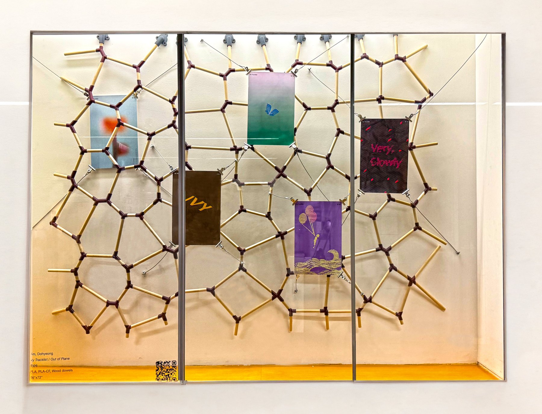
The book sat alongside its sibling DFD project, Out of Plane. Five posters from the book were printed at 18 × 12 in (double the book size) and installed using wire and metal clips, an industrial display language drawn from my father's construction business, which I grew up around. The five posters were positioned in front of and behind the Out of Plane Voronoi structure, so the wall installation and the posters created depth as a single composition. The two capstones, one parametric and one personal, reading as one space.
My Tracklist did the thing I set out to do. It represents who I am in the medium I'm most fluent in, visual translation, and it works at any page you open it to. The exhibition pairing with Out of Plane gave me a way to show both halves of how I work: the systematic, computational side and the personal, narrative side, in one room.
Of everything I've made in school, this is the project I'm most fully satisfied with.