Acro Automation Systems
Hero animation for an 80-year-old Milwaukee robotics company, recreating a system they actually built.
Founded in 1936 in Milwaukee, Acro Automation Systems is a family-owned company that designs and installs robotic automation lines for the automotive, electronics, and medical industries. As a certified FANUC system integrator, they've spent over 80 years quietly building the systems that move American manufacturing.
In 2024, Acro commissioned a hero animation for their new website. Not a generic demo, but a visual recreation of a system they had actually programmed and installed, intended to show that an 80-year-old company still operates at the front of its industry.
The brief was short. "An animation that represents the website. Precise keyframes, strong visuals."
But there was a difficult balance buried inside it. Acro's engineers needed technical precision: how a real FANUC arm moves through a real cycle, because that accuracy is what their reputation is built on. Marketing needed visual appeal. A prospective customer, often not an engineer, had to feel "this company is good at what they do" within the first second of landing on the page.
Too accurate, it gets boring. Too cinematic, it stops feeling real. Holding both at once was the actual project.
How it was made
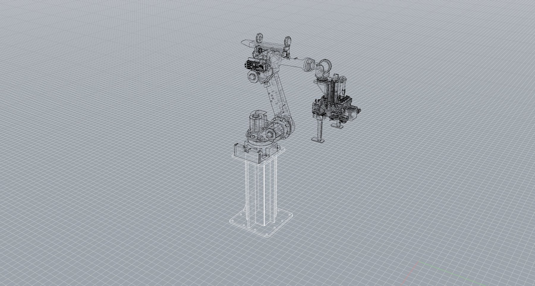
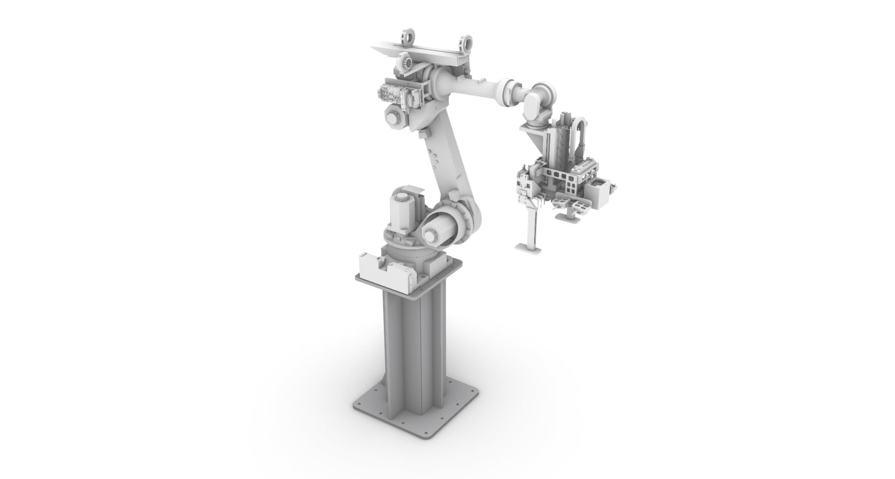
Modeling in Rhino
Working from the technical drawings of an actual cell Acro had programmed, I rebuilt the FANUC arm, conveyor lines, and pickup station in Rhino, keeping proportions and component detail true to the industrial spec.
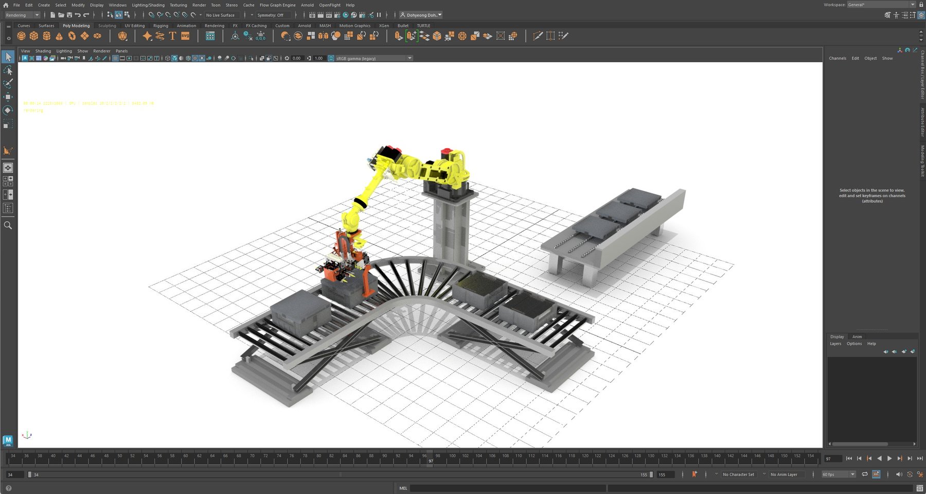
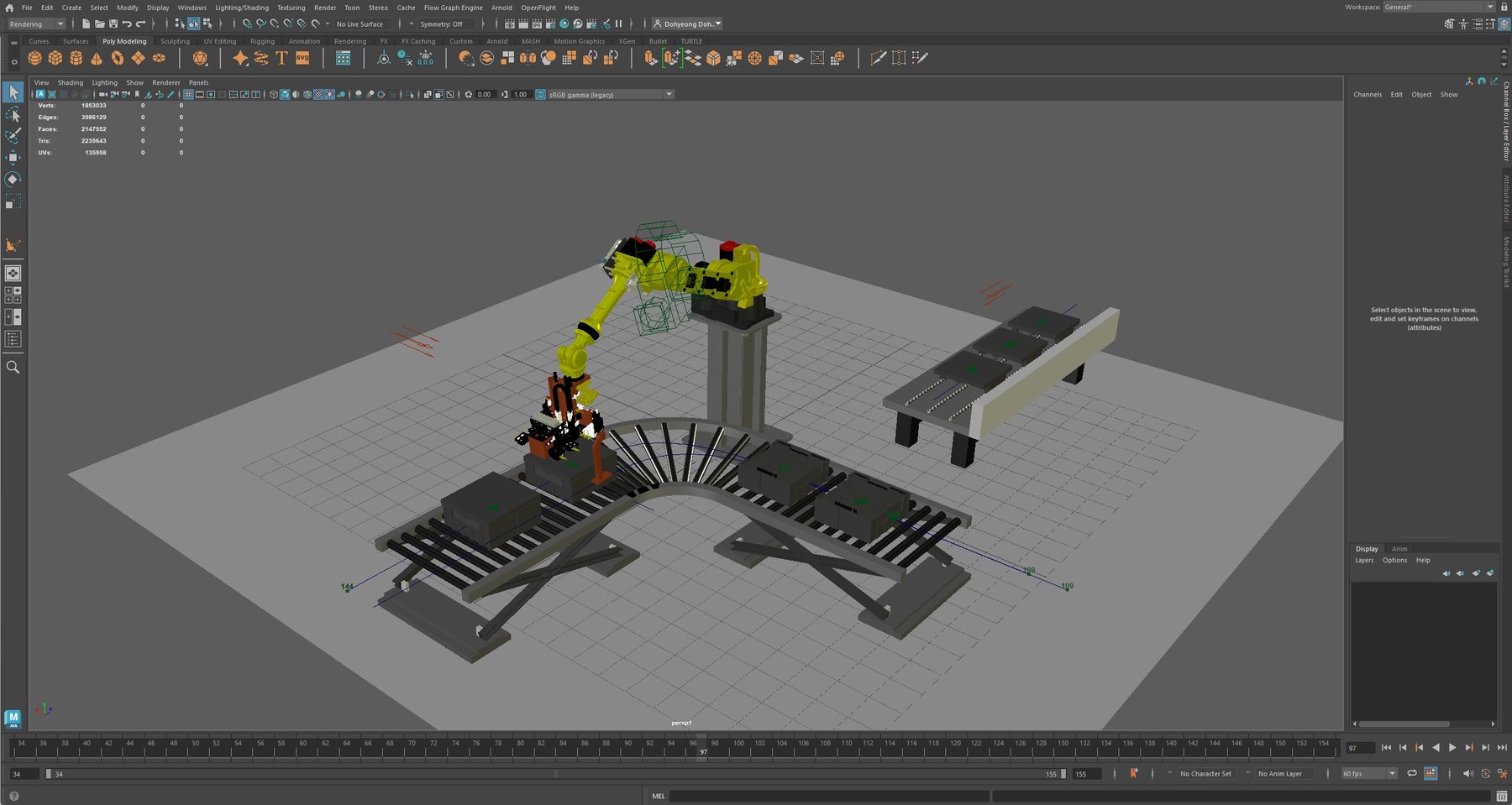
Lighting & Environment in Maya
The Rhino model was brought into Maya, where the work shifted to lighting, materials, camera language, and motion. Camera angle, background tone, and key lights were all dialed in across recurring meetings with Acro's team. Small decisions stacked up over weeks. Camera one degree higher. Background gray one step lighter.
Animation & Keyframing
The motion was hand-keyed across 155 frames at 60fps, mapping the arm's pick-and-place cycle to the rhythm a viewer would actually watch on a homepage. Fast enough to feel alive, slow enough to read.
The white background decision
The white background was a deliberate choice, not a default. Acro's new site was being built on a white base, and the animation needed to live inside the page rather than sit on top of it like a pasted-in GIF. Darker treatments and subtle gradients were tested, but the white version held the page's tone the strongest, and made the arm's yellow do all the visual work.
Multiple angles, multiple versions
Beyond the final, several alternate camera angles and motion variations were rendered. This gave Acro's team something to compare directly, rather than approve in the abstract, which made the final decision a much shorter conversation.
The animation now lives as the hero of acro.com, the first thing every visitor sees.
Acro's response was direct. They said the new site felt distinctly more forward-looking than the previous one, and that the animation was central to that shift. An 80-year-old family company, communicating in one second that it's still building what comes next.